
I promised to post this a few months ago, but it took my reviewing the book to actually do it. Here's the table of contents for Kramers Ergot 7. Those who own the book will find this especially useful, given that the contents page (which is actually a very cool two-page spread by Shoboshobo) greatly favors form over function.
The review is forthcoming, like later tonight (UPDATE: here it is).
Cover: Sammy Harkham
Back cover: Shary Boyle
Endpapers: Shoboshobo
i.: Martin Cendreda
Title page: Walt Holcombe
Credits: Shoboshobo
4-5: Shary Boyle
6: Jerry Moriarity
7: Aapo Rapi
8: Ted May
9-12: Tom Gauld
13: Geoff McFetridge
14-15: Chris Cilla
16: Tim Hensley
17: Daniel Clowes
18: J. Bradley Johnson
19: James McShane
20-21: CF
22-24: Kim Deitch
25: Walt Holcombe
26-27: Chris Ware
28: Jacob Ciocci
29: John Brodowski
30: Jaime Hernandez
31: Matt Furie
32-34: Anders Nilsen
35: Ivan Brunetti
36: C. Tyler
37-39: David Heatley
40-41: Dan Zettwoch
42: Johnny Ryan
43: Mat Brinkman
44-45: Eric Haven
46-47: Conrad Botes
48-50: Josh Simmons
51: Richard Sala
52: Jesse McManus
53: Rick Altergott
54-55: Matthew Thurber
56-58: John Hankiewicz
59: Ben Katchor
60-61: Frank Santoro
62-63: Seth
64: Leif Goldberg
65: Blanquet
66-68: Blex Bolex
69: Sammy Harkham
70-71: Will Sweeny
72: Ben Katchor
73: Kevin Huizenga
74-75: Adrian Tomine
76-77: Florent Ruppert & Jerome Mulot
78-79: Anna Sommer
80: Ben Jones & Pshaw
81: Jonathan Bennett
82-83: Helge Reumann
84: John Pham
85: Matt Groening
86-87: Xavier Robel
88: Souther Salazar
89-90: Jerry Moriarity
91: Joe Daly
92-95: Ron Regé Jr.
96: Gabrielle Bell
97: Conrad Botes
Friday, March 13, 2009
Wednesday, March 11, 2009
Now in poll form
Haven't done one of these in a while:
The case for Watchmen: If you're reading this, you know all about Watchmen.
The case for "Two Minutes to Midnight": Has a pretty catchy chorus. Guitar solo is a little disappointing. Here's the video for those unfamiliar with the song:
It's very important that you remember that you're voting for the song, not the video. We want to keep these things as scientific as possible.
(Yes, there will be more of these things--they just won't involve Alan Moore comics. For the record, I voted for Watchmen.)
Monday, March 9, 2009
Generally short items
Check out Sean Collins and yours truly going back and forth on Black Hole:
Here. We've talked about doing it again later this year--maybe for Epileptic.
Still planning on looking at Kramers Ergot 7 for my next SC post.
Question #1:
Is there any comics art style more unambiguously dated than the Bruce Timm/animation-influenced style? When you see contemporary comics drawn in a 1970s Sal Buscema style, or a primitive Golden Age style, you immediately process this as a deliberate choice, intended to convey quaintness or to establish a time period, or something like that. The Image style isn't quite to that point--nothing ironic about Ian Churchill or Ed Benes--but it's coming soon. You'll see Jim Lee go from slow-but-extremely-popular to slow-but-kitschy. I'm not sure if All-Star Batman is slowing or accelerating this process; I'm guessing it's the latter.
But that Timm-influenced style, it keeps plugging along, sending me back to the mid-to-late 90s every time I see it.
Injury to stop publication:
FUUUCCCCKKKKK. (Via Spurgeon.) Look, I'm going to miss Crickets and Or Else as much as anyone, but taking away Injury is like a kick to the shin. Now are we justified in cheering for Diamond's collapse?
Question #2:
Does reading DC/Vertigo comics cause brain damage? Is there something toxic in the ink? Should I be wearing latex gloves and a respirator next time I'm stuck in a situation where I feel the need to read one of those books?
The great thing about the Scans Daily debate, besides Christopher Bird's post (also this one, but kind of to a lesser extent)?
Now you have a better idea of what I mean when I talk about blogs which I can no longer stand to read. (HINT: I'm not talking about Scans Daily, which I've never read without following a link from Dirk Deppey or someone else.)
Question #3:
Which is better: Watchmen or "Two Minutes to Midnight"? I think I like Alan Moore and Iron Maiden about equally, but Watchmen is a bigger component of Moore's oeuvre than "Two Minutes" is for Iron Maiden's. It's close, though.
Monday, March 2, 2009
Interview: Paul Maybury
Paul Maybury came to my attention with Aqua Leung, but those more plugged into the world of webcomics probably first encountered him through Party Bear, his contribution to the ACT-I-VATE collective. After putting the strip on hiatus to finish Aqua Leung, Paul is now returning to Party Bear. We discussed the difficulties of writing a comic with an African American-majority cast, Paul's creative process, and his plans beyond Party Bear.
I've got a new theory that there are two types of people: those who find primates (gorillas, chimpanzees, monkeys, etc.) funny, and those who find bears funny. I know I'm definitely in the latter camp. Do you consider yourself a bear person?
I think bears have a certain charm to them. It's an animal who's identified with terror, as well as a term of endearment by many couples. Which works well as a character in a story I must say. I also think that monkeys are in the same category as pirates, ninjas robots and zombies. I need a break.
I think a lot of people agree with you about that.
That's interesting that you bring up the cute/scary dichotomy with bears, since it seems like those are the two qualities a child might want from a father: a tough exterior, but cuddly and loving to the family. It's the "Party" in Party Bear that adds an extra degree of weirdness. Is that mostly a joke, or will you be explaining it later on?
The whole idea stems from a drawing I did in 2004 titled "Dealing with Esteban". I just liked the way it looked, and it sort of had a fairy tale element to it. I won't really explain why he's a Party Bear in the story, as I feel it's more fun just guessing what he's all about, and adds to his magical mystique.

What led you to the story, characters, and settings of Party Bear? Do they reflect your own experiences, people you knew, etc?
Well, a few years ago I was approached by ACT-I-VATE early on to do a webcomic under the group name. So I just sort of dug up this image that I really liked, and I started to craft a story that was a tribute to a lot of early 90's urban drama movies, like Colors and Fresh. It's also set somewhere in my memories of Boston and my own personal middle and high school years. I grew up in Jamaica Plain, but because of busing I was sent to The Lewis Middle School, which is in Roxbury. This had quite a profound impact on my life. All of the characters in the book are loosely based on friends with the exception of Officer MacMurphy and Esteban, who are inspired by the movies I mentioned. The story itself has evolved as I've worked on it, and I've gone so far as to rewrite and redraw various scenes throughout the book if early readers were paying attention.
Many characters in Party Bear seem to be in somewhat difficult circumstances (I'm thinking about the Doritos that Seal's mother forces on him for breakfast), but it's a funny comic. Do you think there's some special opportunity for humor to be wrung out of the gritty, urban milieu? Does your experience as an outsider thrust into that world give you some extra insight into what makes the inner city an interesting venue for a comic like Party Bear?
I think that it lets me dance around the culture in my writing without feeling like I'm faking it. I'm also a few steps back enough to find humor in those kinds of small moments. I think humor is something that I really wanted to stress, especially with the back and forth between the characters and the constant ragging on each other that I remember. I also feel fortunate enough to be mixed racially, as I don't feel committed to strengthening any culture's point of view, but rather just observe and display it as honestly as I can.
It seems somewhat underrepresented in long-form comics. Comic strips like The Boondocks or Curtis have a predominately African-American cast and take place in cities, but there aren't many graphic novels like that. Do you hope to have Party Bear published in a collected form once you've finished it?
It's true, there just aren't many that aren't leaning towards an overly positive or negative representation of the culture. And when I say culture, I'm not necessarily just talking about African-Americans. I'm speaking of the smaller melting pot cities like Boston, that are overpopulated with poor people that are sort of just stuck in neighborhoods that are full of dead ends. I feel it's also difficult to present these issues in comics because there's tension that comes from fear of exploiting characters who happen to be black. I would love to publish the book with the right publisher, but because of the subject matter it's been an uphill battle for sure. This sort of saddens me.
 Have you received any interesting and/or useful feedback from readers or colleagues regarding these issues?
Yeah, some have been very useful. I've definitely tweaked the story to be less abrasive, and as I answer these questions, I'm rewriting and redrawing the first 3 pages to make it an easier pill to swallow. I'm actually pretty grateful that I started this project as a web-comic. I've had a lot of time to grow up with the project and rethink my directions. It's definitely going in a more serious and deeper direction in the end from what I had originally written in the beginning. I think I figured if it was going to be this hard to publish already, I'll take it as an opportunity to throw in some subjects that I wanted to talk about anyways. Such as the failure of the Boston public schools, contrast in parenting directions and reverse racism, all which weren't present in the original story line. I guess I'm only concerning myself with doing the story the way I want to see, and trying to present it in a way that's easily accessible. Maybe those two things don't mix well, and could be the reason it's taken this long to find a middle ground that I'm happy with.
When was it that you started Party Bear? What do you think are the most important ways you've changed your approach to cartooning since then?
September 2006. Which is interesting because I was just really getting underway with Aqua Leung at the time. I took a long break from it to finish Aqua and get some personal life things taken care of. I didn't really do new pages until around page 23, including a bunch of redrawn stuff from early on. A strange thing sort of took place in that long gap. I have progressive palmoplantar hyperhidrosis, which basically means the nerves in my hands are all screwed up. It causes sort of an electric painful tingly feeling through my hands and feet, and makes them shake and sweat randomly, but is brought out more when I'm around people or stressed out. The problem is the progressive part, as I started having the problem when I was around 12, but it didn't make my hands shake much until my mid twenties. That being said, I could no longer control my brush in a finer manner, even though technique wise I was getting there in skill. This has drastically changed my approach and style. And looking at that particular page when I got back really defines that moment for me. I would like to add, this should serve as an explanation as to why I hardly shake hands at conventions.
 On another note, I've grown as an artist, and strive to focus on being a story teller over being some sort of master inker, or writer, or penciller etc. Another reason why I'm handling pretty much every task myself with this book with the exception of Olli, who came on recently to do flats.
How about coloring? You were obviously trying to establish a different atmosphere in Aqua Leung; how is your approach different for Party Bear? Is there any change in technique?
I want Party Bear to feel cold, in a way. Since I moved to Texas, it's something I've missed color wise in my surroundings. It's always sunny, and vibrant. I kind of miss the gray mute colors of a cold rainy day up north. There are a lot more flat colors at work this time around too. I make use of gradients and a "cuts" style like in Aqua Leung here and there still, but it just depends on the scene. Either way I'm trying to be very reserved in my approach. I think coloring is one of my favorite parts of working on my own comics. It's so easy to wreck a scene with crazy colors, or bad lighting, and I think it's one of the most underrated aspects of comics aside from lettering, which is something I'm having a bit of fun doing myself as well.
That's actually something I noticed looking over Party Bear again: there's a lot of variety in the lettering, and it's all generally pretty expressive.
Could you talk us through your process for creating a page of art for Party Bear?
I write/draw everything first in piccadilly notebooks in coffee shops. I like to sort of draw my way through a scene emotionally, then refine the dialog later after writing some brief stand in dialog. It helps me work the page around in a composition that I like as I write too, and I can tell what's too much and too little from page to page as I go.

How long do you expect Party Bear to end up being?
I would like to shoot for 120 pages (half way there),but might fill out to 150. I'm working off a loose evolving script, so you never know. I've been joking with my girlfriend that 27 seems to be a popular year to die as an artist, so I better hurry up in case that's how I'm going out.
Any update on The Adventures of Maxy J. Millionaire?
Maxy J. is trucking along. I've got maybe 30 pages of the script left to write and it's ready to venture out into the world and make some deals. It's an all ages book that I've put a tremendous amount of thought and care into, and I guarantee it's not going to be another cheap kids book cash in, and should be something that I hope will be something everyone can get into and have fun with, and will be a great learning tool.
I assume, then, that you've reworked the original concept quite a bit, since the original 8-page Zuda strip had some adult elements. And there's going to be an educational component, too?
Yeah, the entire thing from Zuda is pretty much scrapped. Other than the boyfriend moving in on his girl Roxanne and them "breaking up". It's going to teach kids about cooking, trying new foods, diversity, manners etc. There's a lot in there, but I've gone to great lengths to not come off as preachy or obvious. I'm extremely excited to start it as soon as I put Party Bear to bed. I need to do something my Grandma can read and then I can look her in the eye afterwords.
I've got a new theory that there are two types of people: those who find primates (gorillas, chimpanzees, monkeys, etc.) funny, and those who find bears funny. I know I'm definitely in the latter camp. Do you consider yourself a bear person?
I think bears have a certain charm to them. It's an animal who's identified with terror, as well as a term of endearment by many couples. Which works well as a character in a story I must say. I also think that monkeys are in the same category as pirates, ninjas robots and zombies. I need a break.
I think a lot of people agree with you about that.
That's interesting that you bring up the cute/scary dichotomy with bears, since it seems like those are the two qualities a child might want from a father: a tough exterior, but cuddly and loving to the family. It's the "Party" in Party Bear that adds an extra degree of weirdness. Is that mostly a joke, or will you be explaining it later on?
The whole idea stems from a drawing I did in 2004 titled "Dealing with Esteban". I just liked the way it looked, and it sort of had a fairy tale element to it. I won't really explain why he's a Party Bear in the story, as I feel it's more fun just guessing what he's all about, and adds to his magical mystique.
What led you to the story, characters, and settings of Party Bear? Do they reflect your own experiences, people you knew, etc?
Well, a few years ago I was approached by ACT-I-VATE early on to do a webcomic under the group name. So I just sort of dug up this image that I really liked, and I started to craft a story that was a tribute to a lot of early 90's urban drama movies, like Colors and Fresh. It's also set somewhere in my memories of Boston and my own personal middle and high school years. I grew up in Jamaica Plain, but because of busing I was sent to The Lewis Middle School, which is in Roxbury. This had quite a profound impact on my life. All of the characters in the book are loosely based on friends with the exception of Officer MacMurphy and Esteban, who are inspired by the movies I mentioned. The story itself has evolved as I've worked on it, and I've gone so far as to rewrite and redraw various scenes throughout the book if early readers were paying attention.
Many characters in Party Bear seem to be in somewhat difficult circumstances (I'm thinking about the Doritos that Seal's mother forces on him for breakfast), but it's a funny comic. Do you think there's some special opportunity for humor to be wrung out of the gritty, urban milieu? Does your experience as an outsider thrust into that world give you some extra insight into what makes the inner city an interesting venue for a comic like Party Bear?
I think that it lets me dance around the culture in my writing without feeling like I'm faking it. I'm also a few steps back enough to find humor in those kinds of small moments. I think humor is something that I really wanted to stress, especially with the back and forth between the characters and the constant ragging on each other that I remember. I also feel fortunate enough to be mixed racially, as I don't feel committed to strengthening any culture's point of view, but rather just observe and display it as honestly as I can.
It seems somewhat underrepresented in long-form comics. Comic strips like The Boondocks or Curtis have a predominately African-American cast and take place in cities, but there aren't many graphic novels like that. Do you hope to have Party Bear published in a collected form once you've finished it?
It's true, there just aren't many that aren't leaning towards an overly positive or negative representation of the culture. And when I say culture, I'm not necessarily just talking about African-Americans. I'm speaking of the smaller melting pot cities like Boston, that are overpopulated with poor people that are sort of just stuck in neighborhoods that are full of dead ends. I feel it's also difficult to present these issues in comics because there's tension that comes from fear of exploiting characters who happen to be black. I would love to publish the book with the right publisher, but because of the subject matter it's been an uphill battle for sure. This sort of saddens me.
Have you received any interesting and/or useful feedback from readers or colleagues regarding these issues?Yeah, some have been very useful. I've definitely tweaked the story to be less abrasive, and as I answer these questions, I'm rewriting and redrawing the first 3 pages to make it an easier pill to swallow. I'm actually pretty grateful that I started this project as a web-comic. I've had a lot of time to grow up with the project and rethink my directions. It's definitely going in a more serious and deeper direction in the end from what I had originally written in the beginning. I think I figured if it was going to be this hard to publish already, I'll take it as an opportunity to throw in some subjects that I wanted to talk about anyways. Such as the failure of the Boston public schools, contrast in parenting directions and reverse racism, all which weren't present in the original story line. I guess I'm only concerning myself with doing the story the way I want to see, and trying to present it in a way that's easily accessible. Maybe those two things don't mix well, and could be the reason it's taken this long to find a middle ground that I'm happy with.
When was it that you started Party Bear? What do you think are the most important ways you've changed your approach to cartooning since then?
September 2006. Which is interesting because I was just really getting underway with Aqua Leung at the time. I took a long break from it to finish Aqua and get some personal life things taken care of. I didn't really do new pages until around page 23, including a bunch of redrawn stuff from early on. A strange thing sort of took place in that long gap. I have progressive palmoplantar hyperhidrosis, which basically means the nerves in my hands are all screwed up. It causes sort of an electric painful tingly feeling through my hands and feet, and makes them shake and sweat randomly, but is brought out more when I'm around people or stressed out. The problem is the progressive part, as I started having the problem when I was around 12, but it didn't make my hands shake much until my mid twenties. That being said, I could no longer control my brush in a finer manner, even though technique wise I was getting there in skill. This has drastically changed my approach and style. And looking at that particular page when I got back really defines that moment for me. I would like to add, this should serve as an explanation as to why I hardly shake hands at conventions.
 On another note, I've grown as an artist, and strive to focus on being a story teller over being some sort of master inker, or writer, or penciller etc. Another reason why I'm handling pretty much every task myself with this book with the exception of Olli, who came on recently to do flats.
How about coloring? You were obviously trying to establish a different atmosphere in Aqua Leung; how is your approach different for Party Bear? Is there any change in technique?
I want Party Bear to feel cold, in a way. Since I moved to Texas, it's something I've missed color wise in my surroundings. It's always sunny, and vibrant. I kind of miss the gray mute colors of a cold rainy day up north. There are a lot more flat colors at work this time around too. I make use of gradients and a "cuts" style like in Aqua Leung here and there still, but it just depends on the scene. Either way I'm trying to be very reserved in my approach. I think coloring is one of my favorite parts of working on my own comics. It's so easy to wreck a scene with crazy colors, or bad lighting, and I think it's one of the most underrated aspects of comics aside from lettering, which is something I'm having a bit of fun doing myself as well.
That's actually something I noticed looking over Party Bear again: there's a lot of variety in the lettering, and it's all generally pretty expressive.
Could you talk us through your process for creating a page of art for Party Bear?
I write/draw everything first in piccadilly notebooks in coffee shops. I like to sort of draw my way through a scene emotionally, then refine the dialog later after writing some brief stand in dialog. It helps me work the page around in a composition that I like as I write too, and I can tell what's too much and too little from page to page as I go.

After that's all set I usually use Eon boards, or Canson (they donated a bunch to me).
I take a look at my notebook, and play Tetris with the panels and find good positions for them on the page if I haven't already in my notes. I'll then lay down the borders in a clumsy fashion with my ruler in blue mechanical pencil.
Then I clench my black mechanical pencil like some kind of an ape and try to lightly pencil the page. I've yet to master the art of erasing, so I try to make it as painless as possible for me later.
After that I do all the lettering, which is a weird mixture of my own handwriting fused with Wholefoods Market sign maker font. I worked there while drawing Aqua Leung, and had to change my handwriting to their house style, and I've never been able to really get back to my own fully. The lettering is done with a Micron 08 and sometimes a faber Castell cheapo brush pen for larger lettering. After the lettering is dry, I lay down the word balloons with the same brush pen. After those dry (I'm afraid of smudging) I free hand the panel borders.
I'm usually doing this to 5 pages at a time in a factory method. That way I'm not just staring at the wall while everything dries. I've recently been inking with a Scharff 3000 size 2, although I jump back to my Winsor Newton sable brush from time to time. Working on 5 pages at the same time helps me make expressive lines while the brush is working for me without having to stop. I usually wrap them all up by the end of the week, then repeat.
I then scan them, clean them up, format them for print then send them off to my flatter Olli, who is a life saver. Once I get them back I work my magic and you have a finished Party Bear page!
I would like to shoot for 120 pages (half way there),but might fill out to 150. I'm working off a loose evolving script, so you never know. I've been joking with my girlfriend that 27 seems to be a popular year to die as an artist, so I better hurry up in case that's how I'm going out.
Any update on The Adventures of Maxy J. Millionaire?
Maxy J. is trucking along. I've got maybe 30 pages of the script left to write and it's ready to venture out into the world and make some deals. It's an all ages book that I've put a tremendous amount of thought and care into, and I guarantee it's not going to be another cheap kids book cash in, and should be something that I hope will be something everyone can get into and have fun with, and will be a great learning tool.
I assume, then, that you've reworked the original concept quite a bit, since the original 8-page Zuda strip had some adult elements. And there's going to be an educational component, too?
Yeah, the entire thing from Zuda is pretty much scrapped. Other than the boyfriend moving in on his girl Roxanne and them "breaking up". It's going to teach kids about cooking, trying new foods, diversity, manners etc. There's a lot in there, but I've gone to great lengths to not come off as preachy or obvious. I'm extremely excited to start it as soon as I put Party Bear to bed. I need to do something my Grandma can read and then I can look her in the eye afterwords.
Wednesday, February 25, 2009
Real short items
My first piece for The Savage Critics:
A review of Black Hole, it's here. Sean Collins did indeed write a review earlier this week as well--your memory isn't playing tricks on you. Later in the week we'll have a final post reacting to each other's review, and maybe reacting to each other's reactions as well. Mark your calendars, fans of reactions.
My next review there:
Probably Kramers Ergot 7. Hopefully that's not what Sean had planned.
Why I will see the Watchmen movie:
I imagine that it will eventually be on basic cable (or satellite, in my case). I still haven't seen The Dark Knight; I'm starting to question if I'll ever bother.
Note #1 about recent Bookscan conversations:
I think the current debates reveal more about the rivalries and relationships between prominent comics bloggers than anything useful about the numbers themselves. This probably would have amused me more a few years ago.
Note #2 about recent Bookscan conversations:
As weary as I am of the phenomenon mentioned above, I'm always more annoyed by the interjections from the peanut gallery. Can anyone point out any instance where Alan Coil has ever added anything of value to any conversation whatsoever?
Note #3 about recent Bookscan conversations:
This is the sad, serious part. Last year I interviewed Andy Graves, the owner of an independent bookstore in Columbia, SC that stocked a lot of art/literary comics. It was the kind of store which I think accounts for some of the discrepancies in the Bookscan numbers. Unfortunately, the Happy Bookseller closed late last year. It's hardly a unique story, which makes it all the more tragic that the popularization of the graphic novel coincided with the steep decline of the independent bookstore. It could have been a vital symbiotic relationship. I mean, I guess it still is for those big, bad independents that are still going strong, but it would have been nice to know that you could go into any medium-sized town in the US, found the local independent bookstore, and known that you could find something like Love and Rockets on the shelf.
This year marks the150th uh, 200th anniversary of the births of Charles Darwin and Abraham Lincoln:
In fact, the day passed a couple of weeks ago. You may have heard scintillating debate over which man was more important to history. This brings to mind other classic "which was more important to history" debates: Millard Fillmore or Ed Sullivan? Blackbeard or Henry Ford? Jesus Christ or the cultivation of rice? The debates rage.
If you didn't know that mixed martial arts had started to resemble Tekken, here is your visual evidence: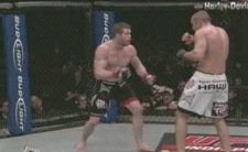 That's Nate Marquardt finishing Wilson Gouveia at last weekend's UFC 95. The amazing thing is that nobody had previously considered Marquardt even one of the top 10 strikers in his division, but now he's pulling off the kind of chain attacks that would be considered too unrealistic for Virtua Fighter.
A review of Black Hole, it's here. Sean Collins did indeed write a review earlier this week as well--your memory isn't playing tricks on you. Later in the week we'll have a final post reacting to each other's review, and maybe reacting to each other's reactions as well. Mark your calendars, fans of reactions.
My next review there:
Probably Kramers Ergot 7. Hopefully that's not what Sean had planned.
Why I will see the Watchmen movie:
I imagine that it will eventually be on basic cable (or satellite, in my case). I still haven't seen The Dark Knight; I'm starting to question if I'll ever bother.
Note #1 about recent Bookscan conversations:
I think the current debates reveal more about the rivalries and relationships between prominent comics bloggers than anything useful about the numbers themselves. This probably would have amused me more a few years ago.
Note #2 about recent Bookscan conversations:
As weary as I am of the phenomenon mentioned above, I'm always more annoyed by the interjections from the peanut gallery. Can anyone point out any instance where Alan Coil has ever added anything of value to any conversation whatsoever?
Note #3 about recent Bookscan conversations:
This is the sad, serious part. Last year I interviewed Andy Graves, the owner of an independent bookstore in Columbia, SC that stocked a lot of art/literary comics. It was the kind of store which I think accounts for some of the discrepancies in the Bookscan numbers. Unfortunately, the Happy Bookseller closed late last year. It's hardly a unique story, which makes it all the more tragic that the popularization of the graphic novel coincided with the steep decline of the independent bookstore. It could have been a vital symbiotic relationship. I mean, I guess it still is for those big, bad independents that are still going strong, but it would have been nice to know that you could go into any medium-sized town in the US, found the local independent bookstore, and known that you could find something like Love and Rockets on the shelf.
This year marks the
In fact, the day passed a couple of weeks ago. You may have heard scintillating debate over which man was more important to history. This brings to mind other classic "which was more important to history" debates: Millard Fillmore or Ed Sullivan? Blackbeard or Henry Ford? Jesus Christ or the cultivation of rice? The debates rage.
If you didn't know that mixed martial arts had started to resemble Tekken, here is your visual evidence:
That's Nate Marquardt finishing Wilson Gouveia at last weekend's UFC 95. The amazing thing is that nobody had previously considered Marquardt even one of the top 10 strikers in his division, but now he's pulling off the kind of chain attacks that would be considered too unrealistic for Virtua Fighter.
Wednesday, February 18, 2009
Was thinking this post would no longer be timely, then Diamond bails me out
(This post is NSFW. It's not pornographic or anything, but I wanted to warn you that there are drawings of bare-chested ladies on down the line.)
So it's come to my attention that Diamond has named Brian Azzarello and Lee Bermejo's Joker the OGN of the year. For those curious, something called Dark Knight: The Joker 1:6 Scale Collector Figure won "Toy Product of the Year," (great year for cash-ins on Heath Ledger's likeness!) and Marvel Masterpieces Set 2 Trading Cards won Non-Sports Card Product of the Year. I'm glad to see that Collectable [sic] Statue of the Year was a separate category from Mini Bust of the Year; I'd hate to live in a world where Batman: Black & White Frank Miller Statue and Women of the DCU Series 2 Wonder Woman Bust wouldn't both receive some kind of award.
Even though there can be no doubting the immense prestige of the Diamond Gem awards (just re-read that first paragraph if you have any doubt), I probably wouldn't have made a mental note of any of this had there not been a post on a prominent blog about a month ago suggesting that Joker was the graphic novel of the year, and implying that anyone who doubted this was a stupid elitist who wanted to wrest the term "graphic novel" from the righteous grip of the masses. I had planned to write some kind of snide response, but then it dawned on me that I had not actually read Joker, nor even flipped through its pages. How could I write something suggesting that another writer was painfully ignorant and unfit to make such statements if I myself had not read the book in question? I mean, what if Joker made Maus look like, I don't know, Women of the DCU Series 2 Phantom Lady Bust? Who would look silly then?
So I went to Borders to find out for certain and, well, it's absolutely, positively not even close to being one of the best things I've read this year. Remember that list I made of all the stuff I would consider (or would like to consider) for a year's best list? Every single thing I've read on it is better than Joker, and not by just a little. I don't like Lee Bermejo's art at all, and I guess I'm immune to the charms of Brian Azzarello's writing (especially his dialogue, which I take to be one of his strengths according to his admirers). The whole thing felt like a gritty crime caper squeezed into a pair of ill-fitting spandex tights. That scene with the newsie? The one holding up a newspaper with a headline about the Joker's latest shenanigans, so as to inform the reader that Joker is back and Gotham is terrified? That's just schlocky. Terrible.
I mean, I understand the purpose of Joker is to exploit the most recent Batman movie, to attract consumers who liked Heath Ledger's portrayal of the Joker. (I would think the cover does it a disservice in that it's not clear this is the "movie" Joker, but the thing seems to have sold well enough, so what do I know?) Personally, I found it distracting, a constant reminder that this was a cash grab on DC's part. I mean, it's a smart move, and I don't blame them or anything; this is exactly the sort of thing bloggers rightfully complain about when some company (cough, MARVEL) fails to have a palatable tie-in for the quasi-interested moviegoer. But really, now: does Lee Bermejo have to "cast" Johnny Depp as the Riddler? I'm not sure if Bermejo drew this before or after Michael Caine claimed Depp would be in the next movie; either way, it's just as lame here as when Salvador Larocca or Bryan Hitch do it.
So no, I cannot fathom how anyone could proclaim Joker to be the best graphic novel of the year. It speaks to one of the following: (1) woeful unfamiliarity with the wide, wide array of comics with greater ambitions, and more successful realizations of their ambitions, that were published in 2008; (2) taste so far removed from my understanding of what constitutes worthwhile comics that I question my own grasp of reality; (3) a weird definition of "graphic novel" that excludes every halfway decent comic book-like thing which came out in 2008; or (4) a premium on appreciation for what shoveled the most money into a distributor's coffers in 2008.
As long as I was in my local Borders (which, BTW, looks about as sad as you'd expect given the chain's current woes--those manga shelves are anemic, they're literally debacled; on the other hand, you can't sneeze without tripping over a Watchmen display, or something like that), I figured I might as well check out a few other books which I had heretofore ignored when considering the best of 2008. In a couple of cases, I read copies from the local public library. Briefly:
Too Cool to Be Forgotten
I never cared for Alex Robinson's art. In fact I hated it with a burning passion that has only faded in recent years as I've realized that it's not 1998 anymore, and that Robinson has probably learned a few things over the last decade-and-change. This is, of course, absolutely true; he's actually turned into a good cartoonist. I still don't find his style all that appealing, but he's a confident storyteller and character designer. It's a little annoying when you get the sense that Robinson is holding back a little--there's a sequence on page 94 that suggests that he's capable of more interesting linework than what fills most of Too Cool to Be Forgotten. But he's got a leg up on most working cartoonists.
Overall, I thought it was a pretty okay book until the end, which is about the schmaltziest thing I've read in ages (or it would be if I hadn't read (and reviewed) Never Land recently). It's a really hackneyed sort of ending, though I could see it really speaking to those with raw wounds similar to the protagonist's. But I still found it simplistic, implying that healing psychological wounds is kind of like solving a jigsaw puzzle. Too Cool to Be Forgotten is worth reading, and has as nicely designed a cover as I can remember seeing in 2008, but it's not one of the best comics of the year.
The Alcoholic
First the cover: I hate photo covers on graphic novels. It makes sense for prose novels because there aren't any pictures inside, so it doesn't really matter what's on the cover as long as it's aesthetically pleasing and encourages purchases. Those are also the goal of most comics covers as well, but the difference is comics do have interior art. Having an interest in what's actually inside a graphic novel or comic, I expect the imagery on the front cover to bear some resemblance to the interior art. There are, of course, exceptions; I wouldn't dare complain about those great Carmine Infantino and Neal Adams covers in the 1960s, for instance. But that's partly because I think they're engaging in a type of visual narrative themselves, which, as Eddie Campbell has argued, is a sort of cousin to comics, and worth our time in and of themselves. (At least I think that's what Campbell has argued, but for the love of god don't go by my memory/interpretation of his words.) The cover of The Alcoholic, however, conveys the impression that the book is ashamed by its guts, almost like it's trying to lure in the fabled casual reader by intimating that it's not really a comic book. It's just like a regular book, see?
At least that's what I think whenever I see a cover like this one. This is at least a shade better than Vertigo's other major OGN for 2008, Incognegro, in that interior artist Dean Haspiel drew the napkin doodle on the cover. On the inside, I thought Haspiel's art was a bit less sharp than I remembered. There are some pages which do shine, like a scene towards the end of the book depicting the narrator (a basically non-veiled stand-in for writer Jonathan Ames) trying heroin for the first time. It's effective for a few reasons--the way the Jonathan's legs form panel gutters for instance--but it's also noteworthy that it's one of the few panels in which Haspiel's Jack Kirby influence is prominent. And that's really Haspiel's strong suit, those sorts of powerful images.

Unfortunately, part of what bugs me about this book is my doubt that Haspiel is the right artist for it. I think he's a fine artist, and his work with Harvey Pekar indicates that he can succeed in a collaborative effort, but I don't think he sounds the right tone here. No matter how mundane his material, Pekar's work is always very much steeped in the traditions of the traditional North American comic book, making Haspiel a good collaborator. Here, though, I think Haspiel's storytelling and cartooning is actually too big, too comic book-y. There's a lot of crying and sadness in this book, the depictions of which almost always involve mouths and eyes agape, actual rivers of tears flowing. Like, you could go white water rafting down those cheeks.
Part of this is Ames' fault as well, as he veers toward the melodramatic. When bad news is delivered over the phone (and it frequently is), characters stare directly into the reader's eyes, shouting NO NO NO in big bold letters. There's certainly a place for melodrama in comics, no question, but Ames and Haspiel seem to lose sight of what kind of book they're making. This is a cancer comic. I don't use that term in an entirely pejorative sense, since there have been many good tragedy-laden memoirs published in the last 10 years--the best probably being Alison Bechdel's Fun Home. But a cancer comic calls for at least some degree of subtlety, as seen in Bechdel's work, or in that of Emmanuel Guibert. (Alan's War isn't really a cancer comic, given the tone and content, but it's a cousin.) The approach here is more like the kind of made-for-TV movie I saw during my childhood. (Not-so-fun fact: CBS aired one such movie about a classmate of mine who shot and killed two guys who were apparently trying to rob his home.)
There are other problems, like my feeling that I didn't really learn much about the roots of Jonathan A.'s problems. Ames seems a little reluctant to discuss the possible influence of his parents and his upbringing, but it's probably hard to get out of your own skin when writing a memoir like this. The Alcoholic isn't a bad comic. It's certainly better than Joker (high praise indeed!) but probably not as good as Too Cool to Be Forgotten. I liked the ending, which actually makes the execution a bit more frustrating--this might have been pretty good if handled differently. Still, it's almost certainly going to be somewhere in the top 10 on the 2008 meta-list, so kudos for DC/Vertigo's publicity department's work in getting this into the right hands.
Northlanders

This comic is seriously okay. If graphic novels were widely available in airport newsstands, the homes of relatives hosting family gatherings, or the waiting rooms of dentists, tire stores, etc., then I would strongly recommend checking out the first volume of Northlanders. It captures the feeling of reading an issue of Quasar or Kull the Conqueror on a long drive with one's parents. I liked it better than Local or Demo.
You'll find the art by Davide Gianfelice and (particularly) colorist Dave McCraig quite good, at least at first. McCraig's rich colors gives it the appearance of stained glass at times, sort of an ironic (but not unpleasant) effect for a comic about Vikings. It also reminds me of Ernie Colon's art in his 1988 OGN Ax (which is pretty interesting, if you ever get the chance to flip through it). As the series wears on, Gianfelice's line art looks more rushed, the lines heavier and less expressive, almost bordering on latter-day Scott McDaniel territory. Brian Wood's writing provides occasional excitement, and lots of colorful language.
It is by no means one of the best comics or graphic novels of 2008, at least based on the first collection of issues. Maybe the single issues published last year improve dramatically; maybe I'll check out the second volume when it comes out later this year to see for sure.
Monday, February 16, 2009
I swear I'm going to run this every year until someone admits it's funny
I have to admit, this makes even less sense the further we get from those halcyon days of furious reactions to Civil War (responses to Final Crisis are positively panegyrical in comparison), perhaps best exemplified by those ubiquitous/fatuous "Cap was right" banners. Also noteworthy (sort of): I do not have a stepfather; my parents are actually still married. And man, I really liked exclamation points back then.
I added in an entry for President Obama and edited some stuff that seemed excessively dumb in retrospect (obviously that's really saying something). Otherwise, this is the same shit I've run the last two President's Days. Get used to it!
You know, we don't do enough to celebrate President's Day in the DC/Marvelogosphere, which is a terrible shame. So we asked our crack research team, who we guarantee know more about history than you, to rectify this situation. What they came up with is a list of which president best corresponds to which corporate intellectual property. Hope you enjoy!
-Abraham Lincoln: Known as the father of our country, old Honest Abe only needed one nickname: the Rail Splitter. Now we've never been much for physical labor. I mean, occasionally our stepfather would force us to pick weeds on a Saturday afternoon, even though we told him that we were allergic to dirt. God, I HATE HIM SO MUCH....Anyway, we speculate that rail-splitting might have been something like swinging a hammer. So the obvious answer here is THOR.
-George Washington: Known as the father of our country, old Honest George was known for chopping down cherry trees just to prove how honest he is. Well, no superhero says "chop" quite like KARATE KID.
-Andrew Jackson: Waged war on the Indians, killed a man in a duel...sounds like JONAH HEX to us. Plus they kind of looked similar.
-Andrew Hamilton: This president is best known for appearing on a ten dollar bill, being secretary of the treasury, calling for the expansion of the federal government, and being killed by Aaron Burr. We're going to say IRON MAN.
-Aaron Burr: We'll continue our earlier line of thought and say CAPTAIN AMERICA. We guess we'll see this Wednesday--we can't wait!!!!!!!!
-Ronald Reagan: We always associate Reagan with our stupid stepfather, who made us wear a stupid Reagan/Bush '84 button to class. All the cool first graders called me us a nazi and made us eat dirt, which made our allergies act up. Our stupid stepfather had a stupid mustache like DOCTOR STRANGE, so let's go with him.
-Franklin Roosevelt: Well, Roger Stern says CAPTAIN AMERICA, so who are we to disa--wait, we already did Captain America. Uh, let's say USAGENT.
-George W. Bush: We hear he doesn't care about black people, and neither did GREEN LANTERN, HAL JORDAN VERSION. Bring back the other guy! [In all fairness to Hal Jordan and his gruesome legion of fans, I hear that he did care about the "purple skins." -DH]
-George HW Bush: Obviously must be GREEN LANTERN, ALAN SCOTT VERSION.
-John F Kennedy: Taken from us too soon. GWEN STACEY.
-Bill Clinton: The greatest player in the history of the presidents, the ultimate large-testicled sex machine. Clearly you have to go with that stud NIGHTWING. We bet they've even had sex with some of the same women! In the DCU, we mean. We know Nightwing doesn't really exist...yet!
-Warren G Harding: Known as the most handsome president, so we guess he'd be BATMAN. Well, we hear women think Batman is handsome. We can't tell, being totally heterosexual-type guys.
-Dwight D Eisenhower: We think he looks like METAMORPHO. Runner up: DON RICKLES.
-Grover Cleveland: Our greatest president, the man who freed the slaves, proponent of free silver. Clearly the best choice is SILVER SURFER.
-Barack Hussein Obama: Call me old fashioned, but I'm going to say GREEN LANTERN, JOHN STEWART VERSION. I've always thought Denny O'Neill's depiction of a proud, angry black hero was directly responsible for the passage of the Voting Rights Act. The Civil Rights Act probably had more to do with Lt. Flap from Beetle Bailey, though. I guess that would have been a good choice had this been an article comparing presidents to minor comic strip characters. Maybe next year. [Ha ha. -DH]
And there you have it, every president ever, compared to a superhero. Happy Presidents' Day!!!! !!! !!!!!!!!!!!!!!!!!
Subscribe to:
Posts (Atom)
